
SRCERER
Srcerer stack
Srcerer is a collection of 3 image stacks, each serving different needs.
- Srcerer (Sizes): This stack allows you to add multiple sizes (up to 8) of the same image. The browser will then display only the image that is appropriate for the device that it is being viewed on. It is a great approach for speed and SEO.
- Srcerer (AD): This stack allows RapidWeaver users to make use of the 'Art direction' approach of image delivery. What this means is that you can use different images (i.e. different crops / aspect ratios) for different devices.
- Srcerer (Single): Each Srcerer stack also allows you to add various effects etc. If you only want access to these effects (and not the responsive image delivery options in the other stacks) then the Single stack is for you!
The main driving force behind Srcerer is to use the latest html to ensure that the most appropriate image is used on every device type / size. As such I would always recommend using one of the first 2 options listed above.
How to use
You simply need to:
- Choose which Srcerer stack best meets your needs (see above) and add to the page
- Link your image(s) - depending on the stack chosen this will be anything from 1 image to 8 images. These can be local or warehoused images.
That's it!
Of course there are countless options if you want to add some content to your image or apply an effect. Examples of these are below and on the main Srcerer page (and downloadable project file).
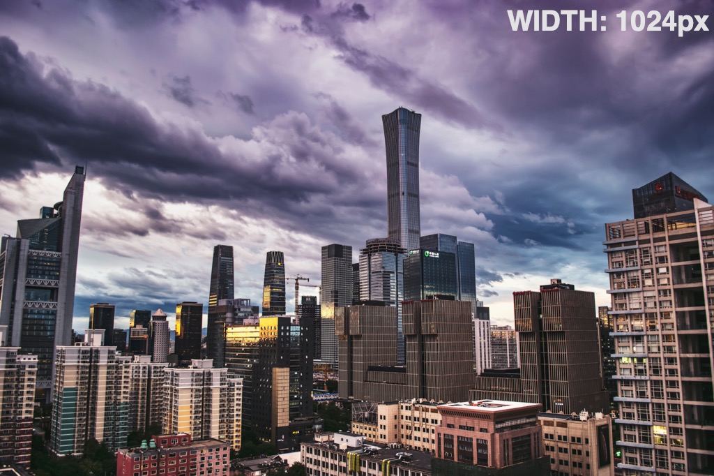
Srcerer (Sizes)
This stack will choose the most appropriately sized image from the range provided.
The example below has the image size/width stated on the image so that you can see the image selected on different device sizes (note you will need to refresh the page to trigger a reload when resizing).
The image sizes made available to this particular stack are:
- 320px
- 640px
- 768px
- 1024px
- 1366px
- 1600px
- 1920px
- 2100px
Notes:
The browser takes into consideration retina device resolutions and uses this along side the CSS pixel width value to determine the best image to use!
You can even add some 'image conditions' to the stack to tell it how much of the screen is being used at different breakpoints (the default is for the browser to assume that the image is taking up all of the available width). This example tells the browser that the image should take up the full width of the screen up to a max-width of 1140px (as this is the max-width of the container that the image is in).
Srcerer (Art Direction)
With the Art Direction stack we can specify different images to be used at different breakpoints. This is a great way of ensuring that the image is meaningful (and important areas are clear) on all device sizes.
Depending on the device that you are viewing on you will either see a landscape image of a woman by the sea below (if on desktop) or a portrait image of the same scene (if on mobile).

Srcerer 'Extras'
If you want to tweak the default settings then you can do so. For instance you can:
- Add content - You can opt to add some content / other stacks above your image
- Create Cards - Creat stunning 'card' effects with your content and images
- Add a link
- Add hover effects - 6 built-in hover effects
- Use blend modes - Blend the image to the background and/or the content to the image
- Add parallax - Add a stunning parallax effect to any image (in one of 4 directions)
Add content
Srcerer lets you add content on top of your images in one of 7 set places. A random selection of some of the examples are below.


Title text


Add hover effects
There are 6 different hover effects that you can apply to the image. A few of these are showcased below.


Add parallax effect
You can opt to apply a parallax effect to any Srcerer image and state which direction you wish the effect to happen.
(These examples also show how to add content in a 'card' type effect!)

Title text

Title text
And more....
There is even more that you can do with Srcerer images, including:
- Adding a link
- Using blend modes - an example of this is the 'see through' text in the header section!
You can of course even combine any of these effects together to create some truly eye catching images on your site!
Srcerer in Source's Grid Plus stack
You can use Source's powerful grid stacks to present your images in various beautiful and interesting ways. These types of image grid would often require the use of background images but Srcerer lets you use the regular foreground images (therefore retaining all of the SEO benefits - alt tag etc!).
Using different spans here to create an irregular looking grid. And you can obviously still add content / hover effects etc (hover over the yellow picture to see an example!).


Some added content

A demo of the Srcerer stack from Shaking the Habitual.
Demo project built using Source - the FREE 'micro' framework for RapidWeaver.